

Monday, 31 January 2011
Wednesday, 26 January 2011
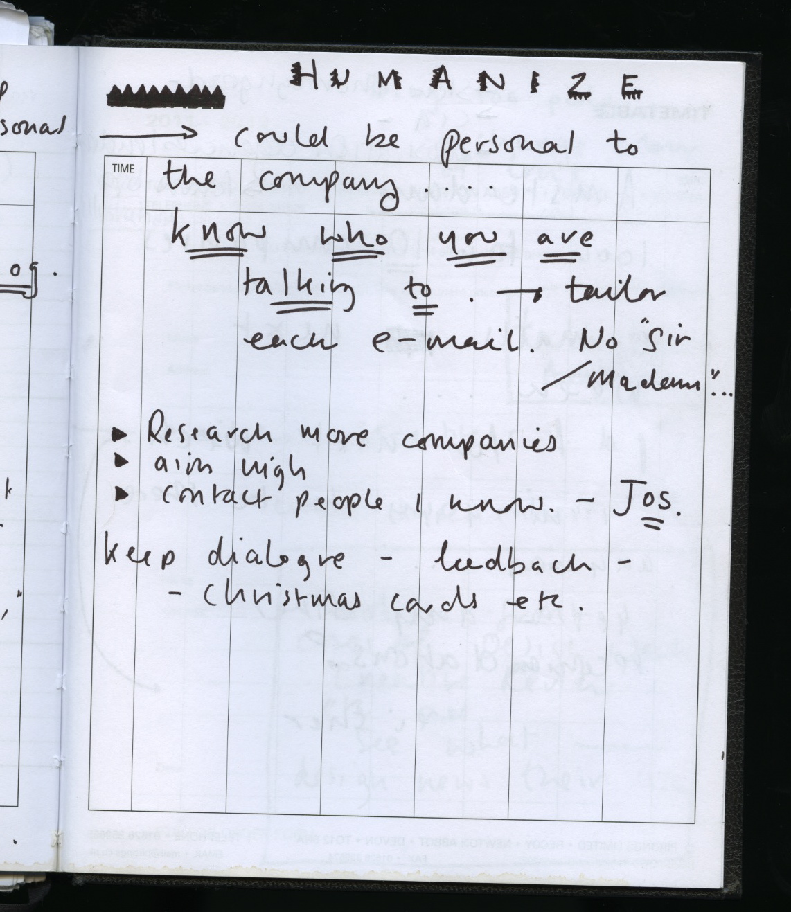
contacting 'good illustration' agency
I sent an e-mail to 'good illustration' a couple of months ago after a conversation with Jane, to see if I could get some formative feedback and potentially a visit. I have heard nothing, and in our recent ppd tutorial Jane suggested contacting them again. I have nothing to loose I guess! So here we go....

It's probably an awful e-mail in terms of what is the right thing to say and the proper way to address a company, but I gave it a shot!
Breed Collective
I've fallen in love.... Pav told me about the image based design collective Breed, which I had not heard of before. This seems mad to me now, seeing as I am a massive fan of the work of Si Scott and Natasha Law who are both part of this collective.... I am so glad I had a look. I NEED to work for a company like this. I want this to be ME. This has given me so much enthusiasm for the industry now I realise that there are agencies specializing solely in image driven design and type. Now I need to find more more more they MUST EXIST!

Impressive and extensive client list :

Contact deets :

The fact that they are London based gives me no excuse but to consider contacting them for industrial experience seeing is London is close to home and essentially where I want to get my work experience where possible..... aim high.... who cares.
Si scott work :


Natasha Law :

Yey.
Monday, 24 January 2011
WEBSITE ARTWORK DESIGNS FOR ART INSTALLATION.....


This is just a starting point but I'm getting there! The deadline for entries is the 28th of February so I want to get it done before then so we can submit the link with our designs!

Sunday, 23 January 2011

Wednesday, 19 January 2011


Sunday, 16 January 2011


Monday, 10 January 2011
SILENT MOVIE BRIEF EVALUTATION
Final four chosen animations...
1) "CRUNCH"
After a lot of tweaking and a lot of layers, I finally achieved the effect that I wanted from this animation. I think that the fade out which I added at the last minute helps to round of the animation, rather than ending with the remains of the word. This issue arose when I reduced the amount of frames so that the animated bites were at a more reasonable speed for the length of the animation. I never added colour because I like the simplicity of the black and white.
4) "CRUNCH"
I think that this is one of my most successful attempts because I think it is a lot more interesting and complete as an animation. I like how it has a beginning, middle and an end. However I think that the beginning could have started off as a solid block rather than a jagged shape. I wanted to introduce another colour, but I also wanted to make it in-keeping with the flickering camera style, so I added just small flashes of colour. I chose a bright, fresh green colour because I think it gives the visual idea of a fresh green apple which in my mind is synonymous with the sound 'crunch'.
3) "STRETCH"
I think that the time spent researching as discovering how to tweak and stretch these letters is not reflected in the quality of the end result of this animation. This is my least favourite of the 4 animations I chose as my final pieces, although I think that the font works well with the word and the desired effect was created. In retrospect I think that colour could have added a bit more depth and excitement, perhaps coloured objects that moved about at the same speed, and same style as the way that the word animates.
4) "BOUNCE"
In this animation I slightly broke the rules of not using image, but I love the effect that was created by the bouncing ball rather than the bouncing word or letters themselves. It took me a lot longer to animate this shape than it did with any of the words, but I think it was worth it in terms of preparing myself for the next part of the brief in which I definitely want to work more with image. I chose this sky blue colour because I felt that it was fun and lighthearted like the word 'bounce' and also gives the imagery of a ball bouncing high into the sky. I think the most successful element of this animation is the realization of distance of the ball in realation to the viewer. I found this particularly difficult; using scale and position to give the impression of distance rather than being able to move the camera or object like you would if you were filming.
MARKETING MYSELF :
Interactive marketing methods...


These posters are by the agency DDB/Sao Paulo, printed for and as for the sound production company 'Saxsofunny" in Brazil. I like tactility of these posters in the way that the posters are capable of making the noise that is being communicated in the graphic; thunder, bonfire and typewriter. I like the idea of promoting myself in a way that could be quite interesting and interactive.
MARKETING MYSELF :
Interesting marketing ideas....

I love this take on marketing a detergent : absolute confidence in the product! I think that this is a really interesting and positive way of marketing something. I could adapt this way of thinking when promoting myself.
Monday, 3 January 2011
PROMOTION EXAMPLES
I don't have to promote myself only through the traditional methods, and I do quite like the idea of my portfolio or my identity as a designer being promoted through something multifunctional and potentially useful. I love this calender made up of matches designed for VS Energy International Ukraine by Yurko Gutsulyak. It reminds me off an advertisment for something like a second hand car, or piano lessons, where you tear the phone number off as little seperate tabs. This could be a relatively lo-fi and cheap way of promoting myself.


BUSINESS CARDS
Allthough the card has very short shelf life, I love this card for Bombay Bakery. It certainly gets your atention, especially if you were peckish! The obvious fault is that it doesn't serve perhaps half the purpose of a buisness card; something you can shove in your wallet for later! But I still think it's really impressive! Although it is for a bakery, I think it could work for a lot of different trades, design being oneof them due to its exciting and interesting nature....
Created by Dizzy Design.

Created by Dizzy Design.
PORTFOLIO PROMOTION
This is graphic designer Steve Frampton's interesting way of presenting his work for potential clients.... I like how it is simple and compact, but really beautiful and interesting once it is opened out as a full fan-circle...


PROMOTION EXAMPLES
Greig Anderson's really interesting way of presenting a graphic design portfolio :


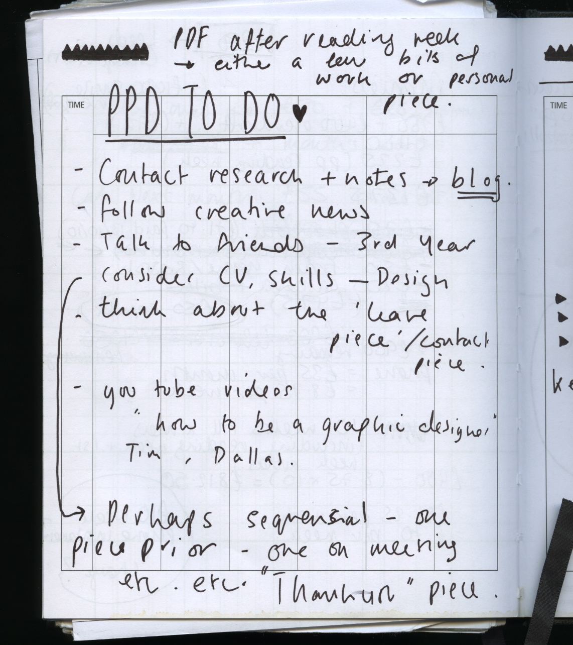
TASK 5
PROPOSED POSITION STATEMENT
1) In terms of the areas of graphic design that I want to focus on for my practice; my main areas of interest are illustration, illustrated type and image driven design work.
2) Ideally I would like to work for a company or agency or collective that tends to work on more light hearted, humourous, design driven briefs. My interests and design practice is more asthetically driven than concept driven, focussing on beauty and what that means above anything else. I would hope to be able to work with like-minded designers.
3) From my research into the kind of place I would like to work, I think I would like to work for a smaller more specialist company or team, where I get to work closely with other designers.
4) Working as part of a team appeals to me greatly, as I think I am a good team player, and I like generating ideas in a group, rather than in the confines of my own head.
5) Working abroad is something that really appeals to me. I like the idea of working, living and experiencing a different culture, and also because a lot of companies that I have looked at in my research, such as 'Mannshaft', 'Bunch' and 'Mopa'; are based in foreign countries.
6) Other than working abroad, I am attracted to London as a place of work, and am interested in a lot of graphic design companies illustration agencies there and what they have to offer, such as 'ilovedust'. I am attracted to the excitement of the capital city as the centre of design and arts in this country.
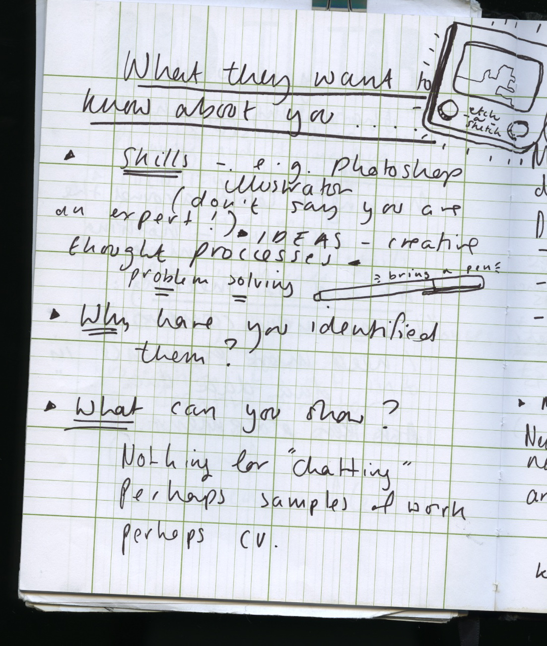
7) In terms of promotion, I think that networking and building initial relationships with companies/agencies is very important. Especially if I want to work abroad eventually. I will do this by directly contacting places and people, in an effort to get industrial experience and let them know I exist. I am also very focussed on developing some other promotional material for myself that represents what I do and the tone of voice of me asa product.... such as buisness cards, website etc.
8) Looking to the near future, as in next few weeks, I want to try and make the most of the opportunities available to me at the moment : I have a place to stay near Amsterdam for the next few weeks, and I intend to try to get myself out there somehow and try to get some industrial experience, even if it is just to look around for the day.
9) Looking towards Easter and the summer break, I want to look to get some industrial experience in London. This could potentially establish some connections with some companies situated there. I will most likely be working in Suffolk back home over Summer, so it would make a lot of sense to try and get some experience locally with companies like 'The Point' in Norwich and 'Herringbone Design' in Aldeburgh.
10) Obviously competition is a huge element to the industry. The way that I will separate myself from the rest is to create a really clear and distinguished image of who I am. I want clients/companies to want to employ me because of what I do, and what I can do for them.
TASK 4
1) CHERMAYEFF AND GEISMAR
http://www.cgstudionyc.com/
137 East 25th Street, 7th Floor
New York, NY 10010
212.532.4595
info@cgstudionyc.com
http://www.cgstudionyc.com/
137 East 25th Street, 7th Floor
New York, NY 10010
212.532.4595
info@cgstudionyc.com


This company is legendary for creating some of the most well known brands in the world.
A strength in their work is consistently stylish which makes people see it as reliable and trustworthy.
They adapt a Modernist ideal; that design is a problem solving dicipline. Clients will go to them for something clean, sleek and to the point, occassionally humourous. This could be a weakness for them in that it could limiting when clients that don't want somehting like this, perhaps for clients that want something a little more intriquing or complicated.
Another strength in their work is that they work across most deiciplines of graphic design making them extremely versatile which must open up a lot more oppertunities for commisions. One of my weaknesses is that my specialised areas are far more limited. Comanies such as this could pose a threat to me.
The firm has a global reach, with projects in Europe, Asia, Latin America, and the Middle East as well as throughout the United States. This and the companies well known well established reputation means that networking and promotion for this agency is not difficult, creating lots of oppertunites for the company. I will have to build my network of clients and communication from scratch.
The firm has a global reach, with projects in Europe, Asia, Latin America, and the Middle East as well as throughout the United States. This and the companies well known well established reputation means that networking and promotion for this agency is not difficult, creating lots of oppertunites for the company. I will have to build my network of clients and communication from scratch.
2) MATTHEW THE HORSE


"Matthew the horse" is an independant graphic designer/illustrator. Despite being a team of just one with a very specific style and themes, his client list includes :
The Guardian, AA Driving School, PlanB Magazine, We are what we do, Illustrated Ape, Venue Magazine, Stergeon White Moss, Creative Review, The Economist, Nature Magazine, Dream Bags Jaguar Shoes....... and more!
This gives me motivation for my own practice which to the greater extent takes a very particular illustrative style...
His promotion is mainly web based, and I actually found it difficult to find out any information on the designer himself, which leads me to believe that perhaps he relies on networking and reviews of his work, for which there is a fair amount from the likes of Creative Review etc. In this respect, I would say that this is his weakness, he doesn't seem short of work, but better promotion could open even more oppertunities. I think promotion and communication is extremely important, especially for new designers like myself. 'Matthew the Horse' is doing a talk on friday the 14th of January so that may give me some better understanding of how is practice works.
3) MANNSHAFT
vijzelstraat 72 - 3.55
1017 hl amsterdam, the netherlands
t +31 (0) 20 - 463 30 63
1017 hl amsterdam, the netherlands
t +31 (0) 20 - 463 30 63


Mannschaft is a team of graphic designers based in Amsterdam. They value working closely with clients; communication being essential to the way that they work. They have an extensive client list featuring both Dutch and English speaking countries. Being situated in Amsterdam allows them to attract a cosmopolitain mix of clients, ultimately broadenning their network and creating lots of job oppertunities. However, a weakness and potential threat is that Amsterdam is an incredibly small city but densly populated with companies and possible clients, therefore, the competition to get the commissions is stiff.
I would like the oppertunity to work abroad, however starting off in this way could make networking and establishing yourself twice as hard.
Subscribe to:
Posts (Atom)