Sunday 20 December 2009

Monday 14 December 2009

Collection 100. Research- Part One

What if... SELF EVALUATION

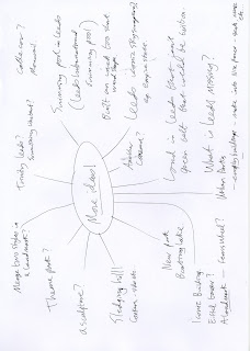
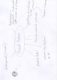
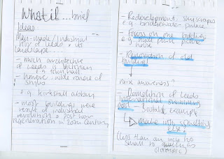
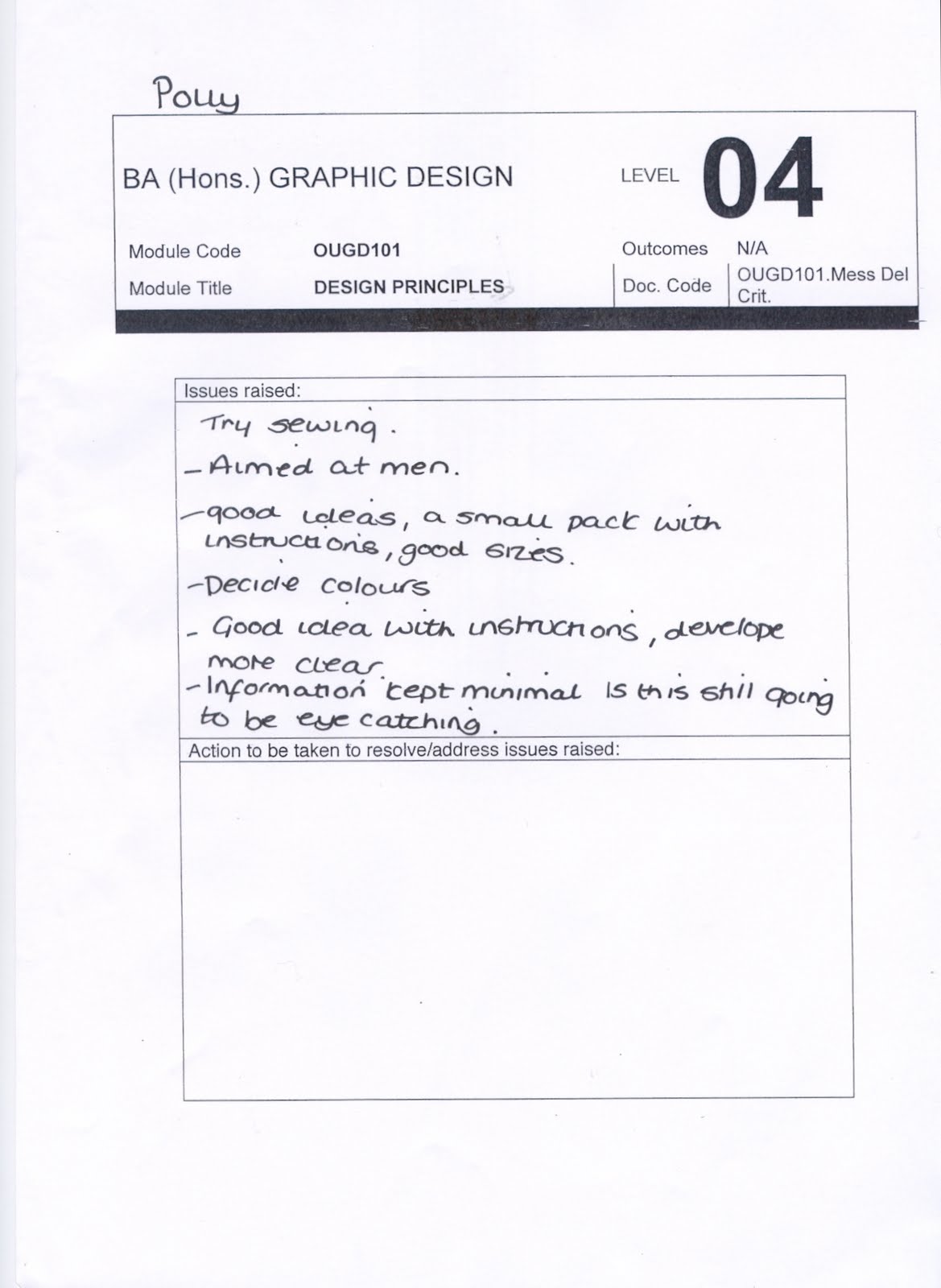
What problem did you indentify?
After exploring a range of possible ideas, as a group we decided that our initial problem was the lack of free public spaces, particularly indoors. Following the first week's research and feedback we re-evaluated and decided that the real problem was that the people of Leeds, specifically office workers) aren't informed enough about the quantity and variety of free public spaces available to them.


What Evidence did you find to support your decisions?
My role in the group was primarily research and ideas based; although most of the project decisions were discussed and made as a group. I did a lot of internet based research into similar projects in Leeds and other cities, which proved that nothing notable had been suggested in the past, or appeared to be in progress which indicated the need. Most of my research was into exsisting promotion of the free public space available, the locations, and other free public attractions. This proved that the spaces and venues are in fact there; simply not advertised successfully enough. For a lot of my research, I tried to use more trusted, less subjective websites such as government, respectable online newspapers and tourist information type sites. However, I also did a lot of research into the idea of the 'lunch hour', to get an idea of how people spend theirs. I found that looking on blogs where office workers are actually discussing this exact subject aided me in understanding the needs of the office worker. Although not primary evidence, I think it's a fairly unbiased, way of investigating peoples opinions. Through this research I came across the fact that the average office worker spends approximately 240 hours a year on their lunchbreak. As a group we all felt that this would be one of our leading arguments in persuading and promoting free public spaces as an alternative to sitting at an office desk.


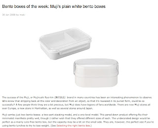
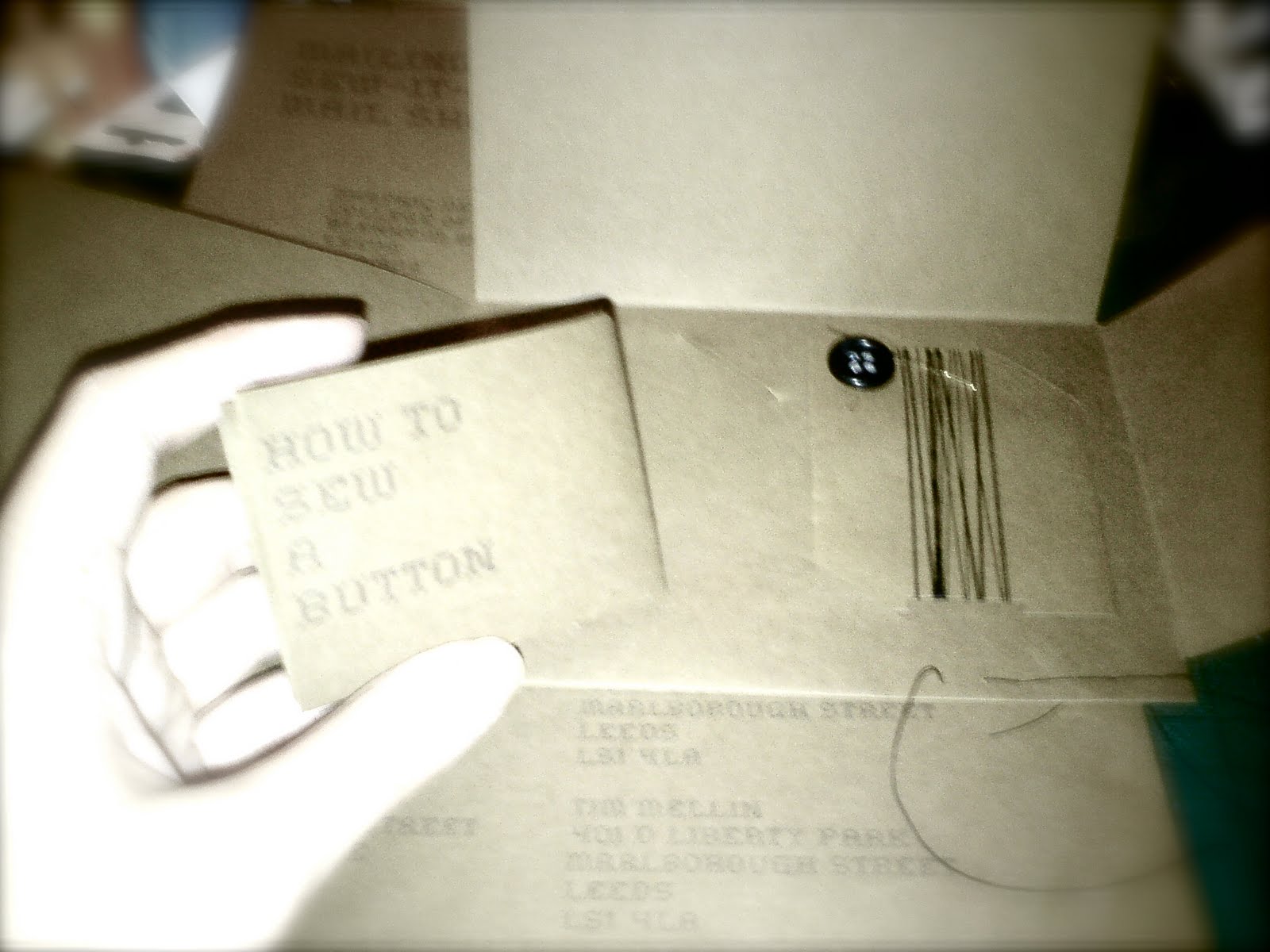
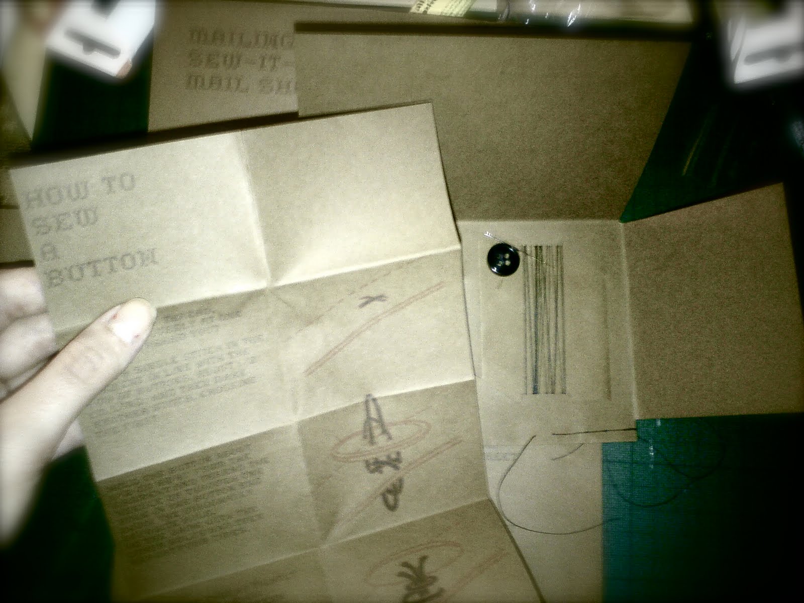
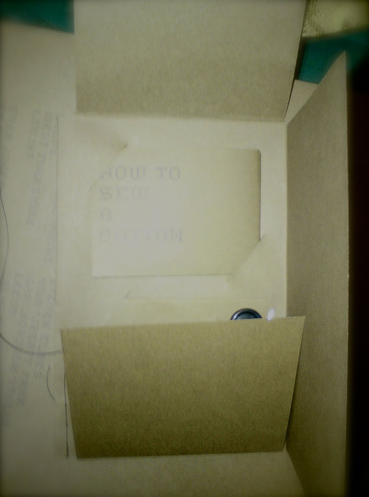
After we decided to promote our website using a free lunchbox, I researched the variety of different lunch boxes available today to help us decide upon a simple and appropriate design for ours.


This article entitled 'Thinking inside the box" inspired me for the name of our campaign
"Eat outside the box". The group agreed it fitted our concept really well on a number of different levels.


I was not involved in the delivery of the questionaires that we issued, however they were discussed as a group. All of our lines of enquirey were discussed as a group before deligating who would complete each task.

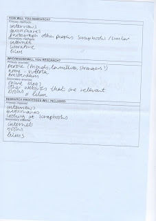
What methods did you use to gather your evidence and what forms did it take?
As a group we used both primary and secondary, qualitative and quantitative methods to gather our research. Methods I used for research:
Primary qualitative methods; the propsed questionaires.
Primary quantitative methods; written observations on the overcrowding of Leeds city centre and lack of obvious/advertised public spaces.
Secondary qulitative methods; Internet research (primarilly articles, blogs, govenment sites, city information and tourist sites, comsumer shopping sites etc)
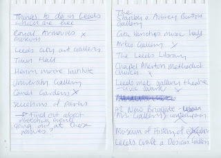
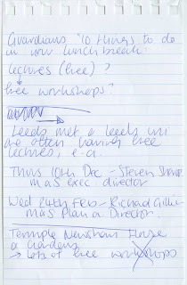
Secondary qualitative methods: discovering amount of possible free locations for people to go to on their lunch hour including parks, squares, galleries, and free lectures and workshops. Also facts and figures with regards to time spent on lunch ours per year.


What methods of research did you find useful and why?
I think that the internet research was useful in terms of ideas and bringing us to our solution, however I think the most useful methods of research were the questionaires and the first hand photographs of areas of the city centre. I think this purely because this was information gathered first hand an so more reliable. Also I think in our project, we really needed to identify the problem and the need for our campaign by speaking to real people about it rather than looking at secondary information and making our own assumptions. The internet research was very useful in terms of time-saving. I think due to the short length of the brief, without internet research it would have been far more difficult to quickly try to locate and find information about existing free public spaces in Leeds.

How did these inform your response to the problem?
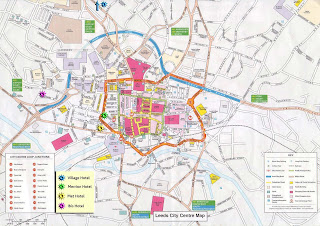
I think that the internet research into how people do already/ could spend their lunchbreaks helped us to find our target audience; i.e. office workers. The questionaires (particulary the one given to actual office workers) helped us to varify our problem and also learn a little more about what people do/want do do with their time. It proved that the majority, given more encouragment and advertising they would like to spend their lunch hour in a different way to the way that they currently do. I also think that the visual research from the centre of town, and the internet research into how well the free public spaces of Leeds are advertised in terms of online and maps was crutial in the motivation of our idea and final solution.

What methods did you encounter as problematic?
I think that internet research is always problematic in the way that you really cant trust a lot of what you read. I also think that our first questionaire was perhaps not specific enough, and angled to encourage the answers we wanted. Also this was not given to our target audience as we hadn't yet identified them yet.

How did you overcome this?
We later issued a second questionaire which was far more open and given to office workers. In terms of my body of internet research, I was selective in what I put forward to the group as evidence; I included information that was objective as possible, such as maps, statistics, council propsals.

What research could you have carried out that would have proved more useful?
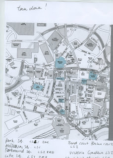
I think that I could have carried out more research into the website design for our campaign. I was only involved in the more content based area's of the website such as the map locations and the ethos; while Nick and Arthur worked on the design. Towards the end we almost had two quite stylistically different designs, but both appropriate in different ways. As a group we discussed them and agreed on a comprise that worked really well in my opinion. However, I think if more research had been carried out into websites and how they appear according to what they are advertising, I think we may have bypassed this issue.

5 Things that you have learnt about the design process over the last two weeks:
  • The better and the more you know about something, the easier it is to solve visually
  • Working in a group requires a lot of communication in terms of every design desision; however big or small
  • When working in a group it is sometimes nessasary to stand down slightly in terms of the more exciting design process in order to make the best of the technical skills of other members of the group
  • the research element of a project is completely vital to the proper development of an idea/solution
  • the value of primary evidence over secondary at times
5 Things that you would do differently next time:
  • I think that we worked really well in the way that we met everyday to discuss the progress of the project, however I think that next time there needs to be more communication with regards to the design decisions
  • I think internet research is something that I'm quite strong at, next time I need to get more involved with primary hands on research, rather than just discussing what we could do, actually be involved in retrieving the information
  • I think that as a group we could have conducted more primary research
  • I also feel that we could have conducted some of our research in a more interesting and inventive manner
  • I think that trying to involve myself more in the design element would be difficult at first because I lack a lot of the computer based skills that other people in our set have, however I wont improve unless I keep using the programs. I enjoyed my small part in the map design; maybe next time I should try something a bit more challenging.


Sunday 22 November 2009

No News is Good News: Message and Delivery Mail Shot Evaluation

I feel that the final outcome of this project was not as I'd hoped. Various complications which arose from my own lack of investigation lead to me making design decisions based on the limitations that I had given myself accidentally. Firstly, in my initial design I used the colours black, white and grey, thinking that this would not be a problem as we were limited to two colours plus stock. However I did not consider the fact that whit would not be possible to digitally print onto black or grey, or double sided, leaving my only possible stock colour as white, which I didn't feel would communicate the image I wanted the mail shot to have. This meant after being satisfied with my colour choices, I had to re-evaluate the whole colour scheme.
Secondly, I made my prototype in thin printer paper, in my mind assuming this would be substituted for a better stock. However, I didn't consider the fact that the fold up instructions worked perfectly on this stock, and for my final piece I wouldn't be able to use two different stocks to achieve the same effect. This meant that I had to try and meet somewhere in between and use a stock that would fold down, but also support the pack inside. I don't think that the end result of this was a disaster, but I certainly think that the instructions would work better if they were on a different stock; for instance a thin but nice quality paper, perhaps slightly glossy to prevent the creases from wearing as quickly.
Another issue with my final piece was the fact that once printed, I found that the ink didn't come out as well as I had hoped. I don't have much experience printing with different stocks, and I think that I simply learnt my lesson the hard way! The black is readable, but not as clear as I'd hoped. Again the orange is viable, and I wouldn't go as far as saying the instructions are hard to read, but they certainly aren't as clear as I'd tried to make them. Also I wanted my mail shot to have strong visual impact, which I feel it really doesn't have with this colour scheme and stock. The black and white design worked so much better; smarter, sleeker and more business-like and masculine. I think the brown works in terms of its earthy, hand-made quality, but I think it lacks impact with the lack of contrast between the colours.
Annoyingly I was ill for most of this week meaning that I missed the the evaluation crit on Thursday. Although I wouldn't have felt confident about it, I wish I had been able to receive the feedback just to see what others thought of it. My progress crit I felt went really well; my group were all positive about my idea. Some commented that they weren't sure what to expect when I had set myself the brief to promote sewing to men, but were impressed with what I had come up with, including the colour scheme. I'd be interested to hear what they have to say now!
On a more positive note, I think that the sewn element to seal the envelope works well. I think its a simple way of furthering the theme, and makes it more tactile. I still like the 'home sweet home' font, and I'm glad I continued to use it for this. I like the way that from a distance it looks quite block-like and digital, tying in with the re-birth of old fashioned crafts.
I am pleased with the instructions which I think are clear in terms of content. Also, because I created the diagrams on illustrator, which is the first time I have chosen to use it! It took me a very long time, but if I keep using it practice will make perfect eventually!
I am impressed with myself for coming up with this design, purely because I've never designed anything like this before, but I think perhaps I threw myself a bit out of my depth in terms of trying too many things that I wasn't experienced with at once! However I know we are supposed to be experimenting and making mistakes, I just hope I learn from them!


No News is Good News: Message and Delivery Crit Feedback

Summery of Feedback:

Decide on colours: Masculine colour scheme
Recycling theme good.
Wallet sized a god idea.
Keep it simple i.e. just the slogan 'S.I.Y'
Envelope works well
Make instructions more clear


Illustrator Project Evaluation


As a first time user of illustrator, at first I found this brief extremely frustrating. I found it fascinating being shown what you are able to achieve on illustrator, but as soon as we began working independently, I found it unbelievably frustrating at how long it takes to construct something so simple. I realise that once you become more accomplished at using the program, it wont take quite so long. When I draw by hand, I make quick pen movements, with what feels like less thought. I also found it frustrating that so many people around me seemed to be so comfortable with illustrator and were churning out all these designs in the time it took me to create my first letter. I felt how I imagine my computer illiterate mum feels when she tries to send and email. However, I soon realised that the brief was all about experimentation, so I literally just played with tools I didn't understand to find out for myself what they each did. I think that my letters don't look that visually appealing as a set, but as individual experiments, I'm really pleased with most of them. I particularly liked the ones where I played with the opacity to create layers, and the ones in which I used the dotted line from the original design in a more elaborate way. I tried not to use the effects, but I felt that my design actually worked really interestingly with some of them. I think that this is because if the repetition within the letter form. As a compromise, I tried to only use effects on letters that I had already manipulated manually, to add to the design, rather than make it. I'm really intrigued as to all the things that can be achieved with illustrator, and in the end I really enjoyed this brief.

Tuesday 10 November 2009

No News is Good News: Poster Brief Crit and Evlauation

For our initial critique of this brief, we each evaluated two other people's work without any information about what headline etc they had based their poster on. I really liked this exercise, as it was done without the designer of each set of posters present, so the feedback we each received was actually honest and much more constructive than in previous student led crits. The main messages I felt came from feedback was that the message 'Sew-it-Yourself' was effective as a play on words, but lacking in explanation. The general consensus was that my poster's have a strong visual impact but the message is not quite clear enough. Another element that was commented on was my colour choices. While one of my critiques said that they liked the colour scheme and felt it was relevant (i.e. pink/red a colour associated with love and the heart symbols), the other felt that the colour scheme had little relevance. I actually agree that my colour choices lacked enough thought and consideration for the message and the theme. I think I felt scared by the two colour limit, so rather than being inventive and working round this with experimenting with different stocks, I simply filled the page with bright colours. I also agree that the blue background is too bright, and prevents the pink text from jumping out as much as it could. I think that this week's colour theory lesson will actually help me with my next colour based design decisions; at least I will try to think more about it. Another element that wasn't really picked up on my crit, but I feel I would change, is the fact that I used a stitched font and image, but I didn't actually stitch it physically. I think that it would add to the theme of my message if I had actually lead by my own example and sewn it myself! I definitely think that the image would have benefited. This is something that I will try to address in the brief following from this project.


Sunday 18 October 2009

Alphabet Soup Evaluation


For my typeface, I chose to respond to Jamie's connection to his ipod as an item which stores his music collection for which he is extremely fond of. I also wanted to reflect his bright, friendly, and playful personality. I chose an easygoing typeface which is easy on the eye and communicates a less serious context. I found this typeface extremely suitable when working with the rounded headphone design. I used headphones simply as a single object that could communicate Jamie's love of music. My colour choices were based upon Jamie's colourful personality and dress sense, and also to reflect the kind of music he likes; 90's, dance and cheesy house, which is music associated with bright, often even florescent colours.


I think the elements that work well are the simplicity; the headphones are a straightforward way of getting across a specific part of his personality. I also feel that the typeface I chose to base my design on work very well with the imagery. I think that despite my doubts, the typeface is actually very legible, and works well when presented as a word as well (the name badge). Having designed most of the alphabet in a fairly formulaic way, I felt worried when it came to designing the letters which I couldn't really fit the formula to, like the 's', 'z', 'i', 'j', 'm' and 'n'. However, after re-tracing each design many many times I think I got there in the end. I think there are often going to be slight objections to the rule, but you can't let yourself get too obsessive about it.
Initially I felt the colour scheme worked well, but in the final crit, and from my conversations with classmates the general consensus was that perhaps less would be more.... perhaps a more restricted use of colour would create a more striking typeface. I had tried to balance the colours, using the lime green and the bright blue to follow the outline of the letterforms as I felt they were tonally similar but not too distracting, and the bright red only in a small area so it would not draw the eye straight to it, but balance with the other colours. I also arranged the colour scheme so that every letter, (even if the letter only had one headphone) had a little of each colour as I felt that it needed some kind of formula. However I think it ended up looking as though I had just coloured the letters in!

Suggestions for improvement in the crit included a coloured background, leaving the headphones white. I can see why this would work well, as the white ipod and cable is such an iconic symbol. Strangely enough, this was a colour scheme that I had worked with in my preliminary sketches. Equally, I think that perhaps using just one colour to highlight specific sections of each pair of headphones might work well.
Now I would like to experiment with variations of this typeface, for instance capital letters, italics, bold, other colour schemes and also using it for something like a piece of print working with it to create words.


Above is the typeface that Arthur designed for my personality. From looking at his work, I think that he has tried to capture a hippy-like element to my personality. The typeface is fairly formal and in capital letters. Perhaps this is to represent a more serious side to me, while the feathered areas show more of my messy, chaotic side. I think that it is extremely visually interesting, and it is very much to my taste as I love illustrative typography and delicate detail. I especially like the way he has only left the bare minimum of each letter; just enough to make it legible within the feather. In terms of what is ineffective about this typeface; I really think the typeface suits me, however I don't know how apparent that would be to someone who didn't know me well already. Also I think this type face is very sophiscicated in black and white, and very neat; which are two things I could not easilly describe myself as! However, for the name badge, Arthur created a collage, and used blue and silver which I felt worked really well. I am really impressed with the way that Arthur actually managed to create a typeface so appealing to my own personal taste.

Monday 28 September 2009

Alphabet Soup Part One Evaluation

In this project I felt that I depicted my given word 'Duplicate' to the best of my ability. My choices of letters were based on they're forms, in terms of which I felt would work best with the design formula that I came up with.
I think the A and the E work best, perhaps because they are more simple letterforms to depict, whilst the G was the lease succesfull, and also the most complicated letter I chose to use.
I think that the colours work well visully, however I chose them simply from experimenting with different colours and seeing which I felt worked best. There was no other considerations in terms of the context. I think that in hindsight it would have made much more sense to try and use colour in a more relevant way. From experimenting on Illustrator, I found that I could in fact have made one letter template and resized it to create the smaller letters. This would have made them identical in shape and form which I think would have worked better to get the concept of the design across more clearly.