Sunday 22 November 2009

No News is Good News: Message and Delivery Mail Shot Evaluation

I feel that the final outcome of this project was not as I'd hoped. Various complications which arose from my own lack of investigation lead to me making design decisions based on the limitations that I had given myself accidentally. Firstly, in my initial design I used the colours black, white and grey, thinking that this would not be a problem as we were limited to two colours plus stock. However I did not consider the fact that whit would not be possible to digitally print onto black or grey, or double sided, leaving my only possible stock colour as white, which I didn't feel would communicate the image I wanted the mail shot to have. This meant after being satisfied with my colour choices, I had to re-evaluate the whole colour scheme.
Secondly, I made my prototype in thin printer paper, in my mind assuming this would be substituted for a better stock. However, I didn't consider the fact that the fold up instructions worked perfectly on this stock, and for my final piece I wouldn't be able to use two different stocks to achieve the same effect. This meant that I had to try and meet somewhere in between and use a stock that would fold down, but also support the pack inside. I don't think that the end result of this was a disaster, but I certainly think that the instructions would work better if they were on a different stock; for instance a thin but nice quality paper, perhaps slightly glossy to prevent the creases from wearing as quickly.
Another issue with my final piece was the fact that once printed, I found that the ink didn't come out as well as I had hoped. I don't have much experience printing with different stocks, and I think that I simply learnt my lesson the hard way! The black is readable, but not as clear as I'd hoped. Again the orange is viable, and I wouldn't go as far as saying the instructions are hard to read, but they certainly aren't as clear as I'd tried to make them. Also I wanted my mail shot to have strong visual impact, which I feel it really doesn't have with this colour scheme and stock. The black and white design worked so much better; smarter, sleeker and more business-like and masculine. I think the brown works in terms of its earthy, hand-made quality, but I think it lacks impact with the lack of contrast between the colours.
Annoyingly I was ill for most of this week meaning that I missed the the evaluation crit on Thursday. Although I wouldn't have felt confident about it, I wish I had been able to receive the feedback just to see what others thought of it. My progress crit I felt went really well; my group were all positive about my idea. Some commented that they weren't sure what to expect when I had set myself the brief to promote sewing to men, but were impressed with what I had come up with, including the colour scheme. I'd be interested to hear what they have to say now!
On a more positive note, I think that the sewn element to seal the envelope works well. I think its a simple way of furthering the theme, and makes it more tactile. I still like the 'home sweet home' font, and I'm glad I continued to use it for this. I like the way that from a distance it looks quite block-like and digital, tying in with the re-birth of old fashioned crafts.
I am pleased with the instructions which I think are clear in terms of content. Also, because I created the diagrams on illustrator, which is the first time I have chosen to use it! It took me a very long time, but if I keep using it practice will make perfect eventually!
I am impressed with myself for coming up with this design, purely because I've never designed anything like this before, but I think perhaps I threw myself a bit out of my depth in terms of trying too many things that I wasn't experienced with at once! However I know we are supposed to be experimenting and making mistakes, I just hope I learn from them!


No News is Good News: Message and Delivery Crit Feedback

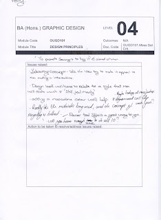
Summery of Feedback:

Decide on colours: Masculine colour scheme
Recycling theme good.
Wallet sized a god idea.
Keep it simple i.e. just the slogan 'S.I.Y'
Envelope works well
Make instructions more clear


Illustrator Project Evaluation


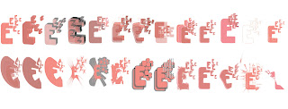
As a first time user of illustrator, at first I found this brief extremely frustrating. I found it fascinating being shown what you are able to achieve on illustrator, but as soon as we began working independently, I found it unbelievably frustrating at how long it takes to construct something so simple. I realise that once you become more accomplished at using the program, it wont take quite so long. When I draw by hand, I make quick pen movements, with what feels like less thought. I also found it frustrating that so many people around me seemed to be so comfortable with illustrator and were churning out all these designs in the time it took me to create my first letter. I felt how I imagine my computer illiterate mum feels when she tries to send and email. However, I soon realised that the brief was all about experimentation, so I literally just played with tools I didn't understand to find out for myself what they each did. I think that my letters don't look that visually appealing as a set, but as individual experiments, I'm really pleased with most of them. I particularly liked the ones where I played with the opacity to create layers, and the ones in which I used the dotted line from the original design in a more elaborate way. I tried not to use the effects, but I felt that my design actually worked really interestingly with some of them. I think that this is because if the repetition within the letter form. As a compromise, I tried to only use effects on letters that I had already manipulated manually, to add to the design, rather than make it. I'm really intrigued as to all the things that can be achieved with illustrator, and in the end I really enjoyed this brief.

Tuesday 10 November 2009

No News is Good News: Poster Brief Crit and Evlauation

For our initial critique of this brief, we each evaluated two other people's work without any information about what headline etc they had based their poster on. I really liked this exercise, as it was done without the designer of each set of posters present, so the feedback we each received was actually honest and much more constructive than in previous student led crits. The main messages I felt came from feedback was that the message 'Sew-it-Yourself' was effective as a play on words, but lacking in explanation. The general consensus was that my poster's have a strong visual impact but the message is not quite clear enough. Another element that was commented on was my colour choices. While one of my critiques said that they liked the colour scheme and felt it was relevant (i.e. pink/red a colour associated with love and the heart symbols), the other felt that the colour scheme had little relevance. I actually agree that my colour choices lacked enough thought and consideration for the message and the theme. I think I felt scared by the two colour limit, so rather than being inventive and working round this with experimenting with different stocks, I simply filled the page with bright colours. I also agree that the blue background is too bright, and prevents the pink text from jumping out as much as it could. I think that this week's colour theory lesson will actually help me with my next colour based design decisions; at least I will try to think more about it. Another element that wasn't really picked up on my crit, but I feel I would change, is the fact that I used a stitched font and image, but I didn't actually stitch it physically. I think that it would add to the theme of my message if I had actually lead by my own example and sewn it myself! I definitely think that the image would have benefited. This is something that I will try to address in the brief following from this project.