This first example is for MOST, a new major showcase for design at the upcoming Milan Design Week. This shows custom lettering applied to logo design - which in this case, is a really appropriate style.
The Collection is a restaurant, cultural event and retail space they collaborated on with Tom Dixon. They designed the identity, signage system and all printed material.
The idea for the identity relates to multiple prints, limited editions and artist signatures. The execution is relatively simple: Everything is based on an A5 format with punched holes. They used screen printing which allowed them to change colours on the printing bed and makes each print unique. Larger signs are made up by several A5 boards and the thickness is achieved by hanging several signs in front of each other. For the logo they asked the client to write the name in their own handwriting connecting two dots equivalent to the punched holes.
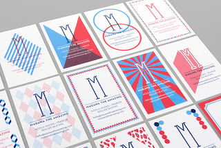
Identity for Marawa The Amazing, an international Hoola Hoop star and performer. The logo is based on the signage of old revue theaters which often use light bulbs. The stationery is printed in 3 colours and every business card is different. They also designed the graphics for an i-phone app and are currently working on the website as well as tags for hoops.
www.marawatheamazing.com
Tess Management
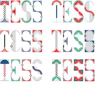
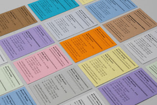
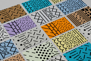
Identity for a a new London based model agency which evolved from Independent Talent. Tess represents well established names such as Naomi Campbell and Erin O'Connor in the UK. The identity uses several logo variations based on a modular system of art-deco inspired elements. The same elements are being used for frames which overlap images of the models on various printed applications as well as on the original website.






No comments:
Post a Comment